By Gert Jan Hofstede, February 2021
Hofstede's globe
In 1985 or so, I made a perspex globe for Geert, showing cultures across the world in colour. Since then, the Internet came along, and Hofstede's globe is now within reach of every Web-enabled researcher or student. I thought it a fitting addition to the Geert Hofstede exhibition.
World coverage is incomplete
The Hofstede culture dimension data matrix began with Geert's original study; after a while, many other studies followed, of which Minkov's WVS-based one stands out. Even so, large parts of the world have not been studied in such a thorough way that this yields reliable data.
Gert Jan's guesses
In order to help those interested in culture get an overview, I made my best guesses, covering every country. Do not use these scores in research as if they were validated! Click the switch to only see validated scores.
What countries are there, anyway?
Some frontiers between countries are disputed. We take no stance on that, but use the available globe maps. Please do not take offence if the map has different frontiers than your own mental map. There are innumerable cultural frontiers that go unrepresented. This globe is coarse, but - I believe - better than nothing.
Legend
On the Hofstede's Globe page, you can select the dimension that you wish to see, and the appropriate legend will tell you how to interpret the colours. Here, you see world Individualism scores, including Gert Jan's guesses, seen from the North.

The world in your hands
Turn it as you like
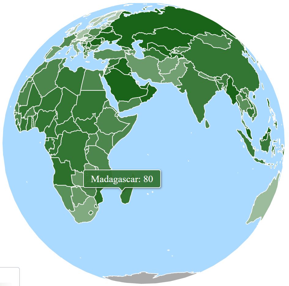
Hofstede's Globe allows you to turn the globe as you like, as if you were in a space shuttle. Depending on your device, it could be easy or a bit harder.
Africa
On the right, you see the globe seen from Africa. I'd like to make my excuses to Africans that see their continent represented in this way: colonial frontiers do not always make culture frontiers in Africa. You can see this map as a step on a long path; more will become apparent about cultural variety across Africa.
Use the world map instead
If you want to see all of the world, click the icon top right, and you get a full world projection instead.
Legend
Again, a legend shows what the colours mean. These colours are the same ones as those on Geert's site.
The resolution and the projection are better though.


Special globe: Markets, Machines, Pyramids and Families
Here is a more advanced topic. I'll write more about it in a BOSS Blog entry.
Gestalt of two dimensions: PDI x UAI
One combination that I find particularly useful is Power Distance (PDI) x Uncertainty Avoidance (UAI). Chapter 9 of Cultures & Organizations is about that combination of dimensions. It makes four configurations of society apparent that had been distinguished in organizations by Henry Mintzberg, and are also apparent in the political lives of countries.
So, I made it possible to pick a PDI x UAI map on Hofstede's Globe. Societies in these quadrants can be characterized as follows:
Market: easy entrance and exit; advertising is important, and so is improvising.
Machine: stable, or changed in a coordinated way; predictability is valued.
Pyramid: stable until time of crisis; specialists are valued.
Family: hierarchy is stable, but everything else is flexible.
Read the book
It would be wise to read the book before trying to work with this graph.
Country comparison graphs in 3D
Below Hofstede's Globe, you find country dimension graphs that you can manipulate.
Pick your dimensions
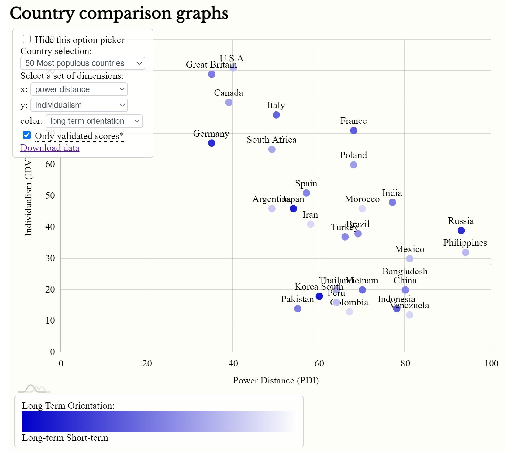
First, you can pick any of Hofstede's dimensons of culture, as discussed in Cultures & Organizations 3rd ed 2010. On the right you see a graph of Power Distance (PDI) against Individualism (IDV). These two dimensions are correlated, but as you see, that correlation is not absolute.
The third dimension in colour
You can add a third dimension. It will be displayed as the colour of that country's dot. These are the same colours as those in Hofstede's Globe.

Country comparison graphs: pick your countries
Many options
You can also pick a selection of countries. You have many options:
Select countries
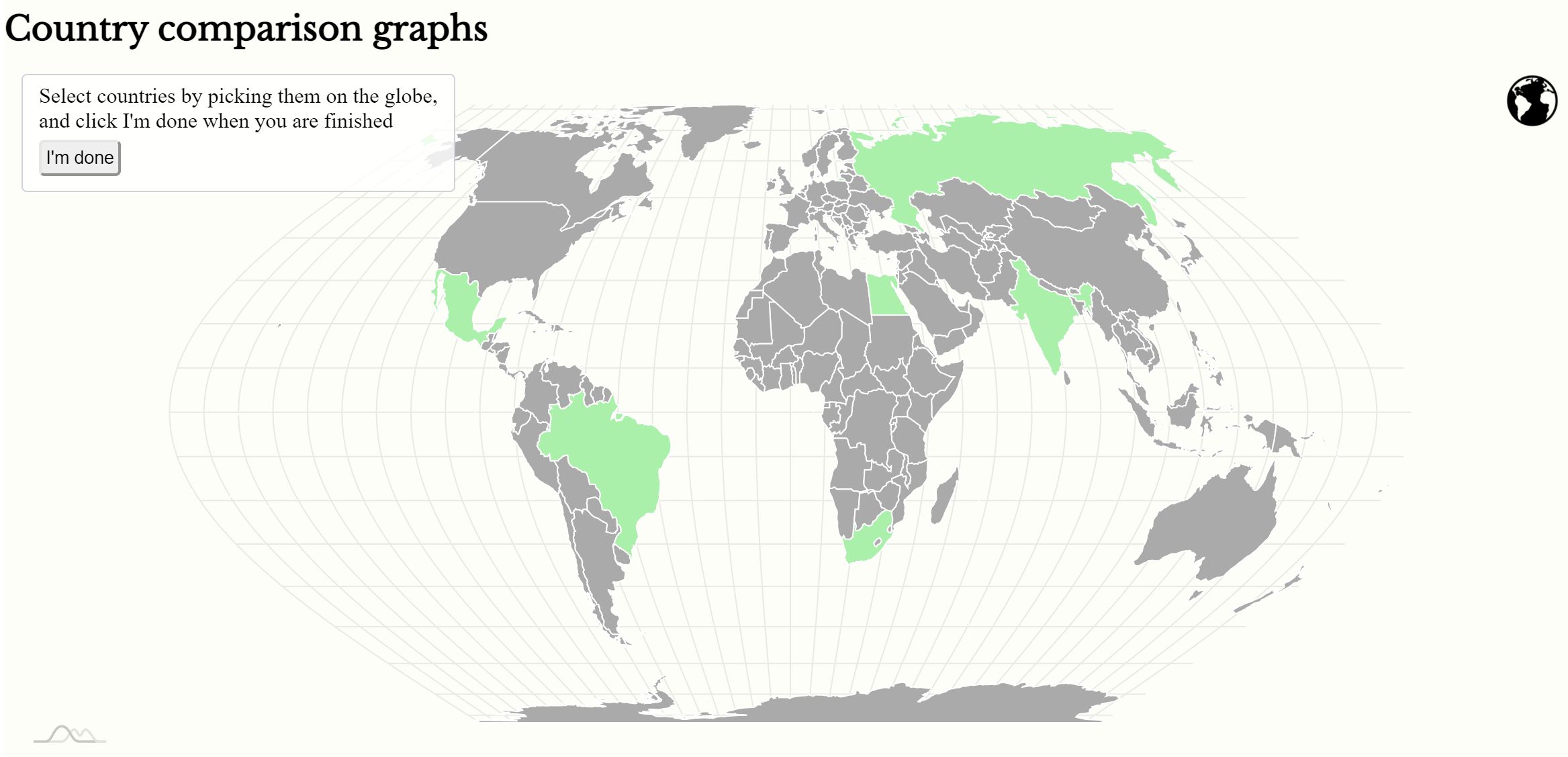
Pick your own selection of countries by clicking them on the world map, or the globe (the globe symbol top right toggles between the two)
Select top 50
Show the 50 most populous countries, as of 2020
Select continent
Show a continent (again, please do not take offence about continent attributions; we make no statement here, but use available options - to me the world is one)
Gert Jan's guesses again
Remember that you can toggle Gert Jan's guesses on or off to make countries appear in the result or to leave them out.
